Look at the source code here.
Look at the documentation here.
ggmitji is an R package with cool functions to complement ggplots.
Dependencies
ggmitji depends on several packages, such as: ggplot2, magrittr, polyclip, cowplot, and ggpubr.
Functions
# Load packages
library(ggplot2)
library(ggmitji)
library(patchwork)
Boxplots
without outliers
If you don’t like to show the outliers in your boxplots, you can use stat_summary_boxplot().
bp_outliers <- ggplot(mpg, aes(class, hwy)) + stat_boxplot() + labs(title = "Made with stat_boxplot", subtitle = "with outliers")
bp_no_outliers <- ggplot(mpg, aes(class, hwy)) + stat_summary_boxplot() + labs(title = "Made with stat_summry_boxplot", subtitle = "without outliers")
bp_outliers+bp_no_outliers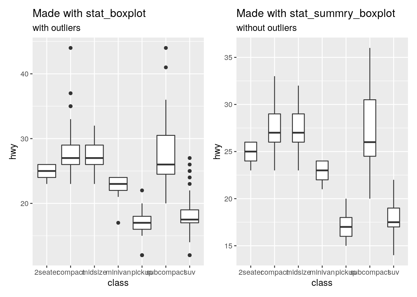
- Note that the outliers are still there for further computations, but they are not plot.
with extra information
If you want to add more information on your boxplots, you can use stat_info_boxplot() and stat_point_boxplot().
stat_info_boxplot()adds information about the number, mean, median or standard deviation of each boxplot. It allows to add a label and specify the size, color and vertical position of the label.
bp_no_outliers +
  labs(title = "Boxplot without outliers made with stat_summary_boxplot()", subtitle = "including information about the mean and the number of observations") +
  stat_info_boxplot(statistic = "n", label = "N=", y = 13, text_color = "darkblue", text_size = 4) +
  stat_info_boxplot(statistic = "mean", label = "µ=", y = 11, text_color = "darkred", text_size = 4)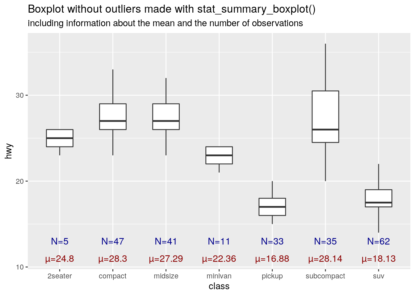
stat_point_boxplot()draws a point at the mean, maximum, minimum or any quartile of each boxplot. It allows to specify color and size of the point.
bp_no_outliers +
  labs(title = "Boxplot without outliers made with stat_summary_boxplot()", subtitle = "including a point for the mean value") +
  stat_point_boxplot(stat = "mean", point_size = 3, point_color = "red")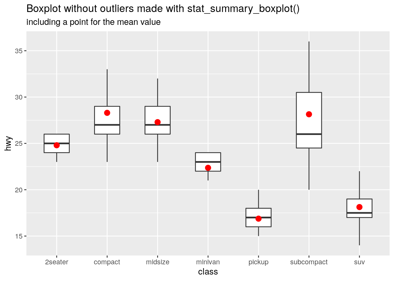
Facets
Facets are nice features to make the plots better. However, if you want to paint the strips with different colors, you have to go through tricky workarounds. Hence, I created the functions fill_strips_top() and fill_strips_right() to fill the top and right facet strips, respectively.
They are not like a normal ggplot2 function, so you cannot use + and you have to input the object directly into the function. Another drawback is that the resulting object cannot be modified by theme(), scale_*_*(), so all the required modifications have to be done before the coloring.
# No colored strips
p1 <- bp_no_outliers + facet_grid(cols = vars(cyl)) + labs(title = "Facetted boxplot with normal top strips", subtitle = NULL)

# Colored top strips
p2 <- bp_no_outliers + facet_grid(cols = vars(cyl)) + labs(title = "Facetted boxplot with colored top strips", subtitle = NULL)
p2 <- fill_strips_top(p2, colors = c("pink", "lightgreen", "gold1", "cornflowerblue"))

# Colored right strips
p3 <- bp_no_outliers + facet_grid(rows = vars(cyl)) + labs(title = "Facetted boxplot with colored right strips", subtitle = NULL)
p3 <- fill_strips_right(p3, colors = c("pink", "lightgreen", "gold1", "cornflowerblue"))


p1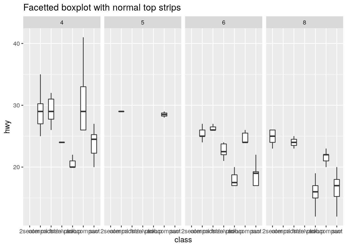
p2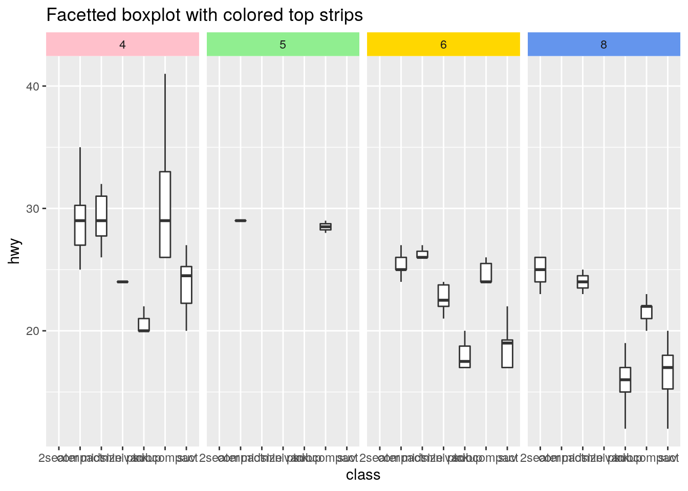
p3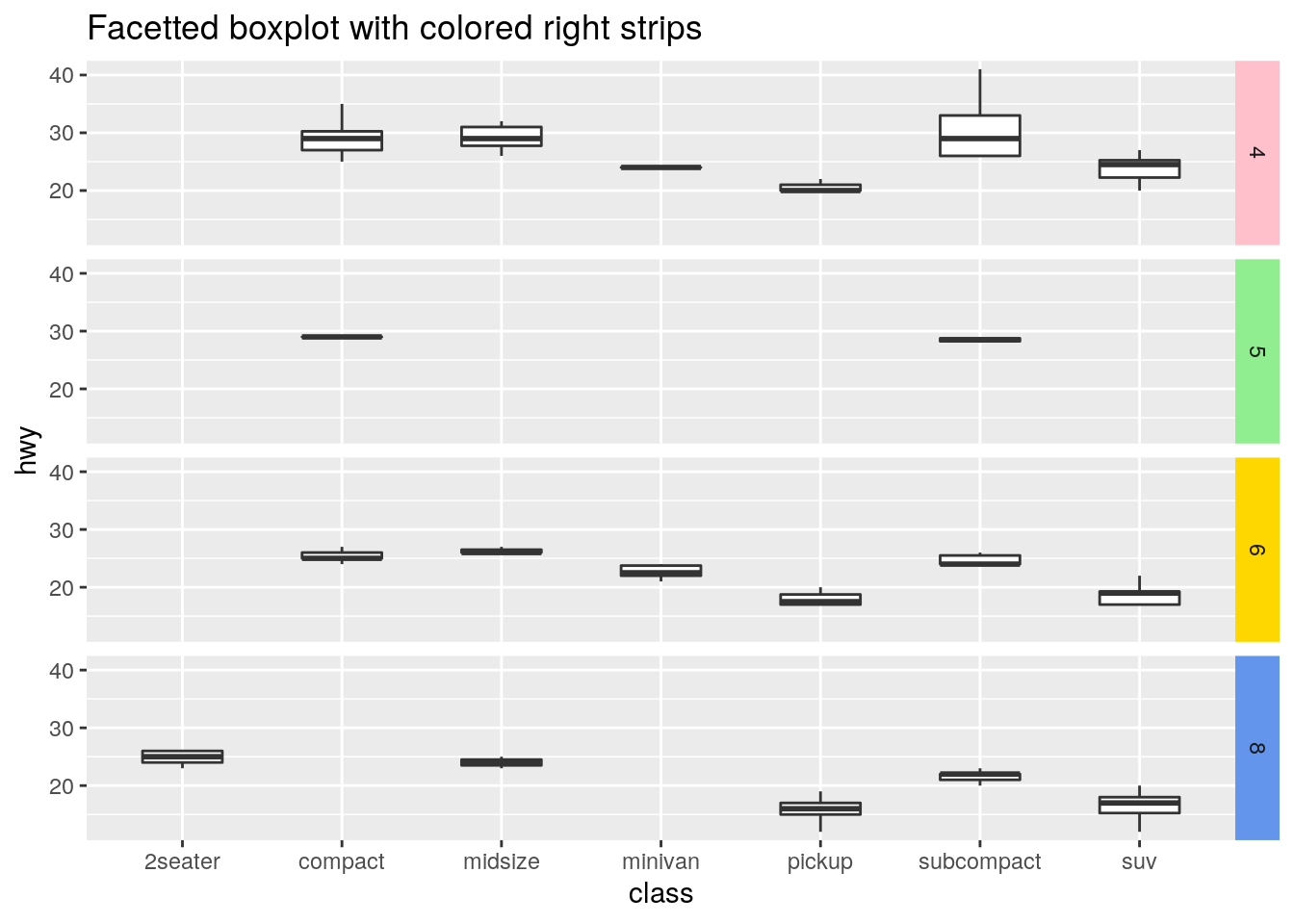
Shaded Venn diagrams
Venn diagrams are useful to show intersections of different sets. Sometimes, the intersections, unions or other areas of the Venn are used to draw other plots. In these ocasions, you can draw a Venn diagram with shaded areas to specify what are you plotting.
For this cases, you can use shaded_2d_venn() and shaded_3d_venn() for 2D and 3D Venn diagrams respecitvely.
shaded_2d_venn(highlight = "AB", color = "blue") +
shaded_2d_venn(highlight = c("noAB", "AnoB"), color = c("Blue", "Red")) +
shaded_3d_venn(highlight =  c("AnoBnoC", "noABC"), color = c("yellow", "green")) +
shaded_3d_venn(highlight = "all", color = "black", line.col = "white")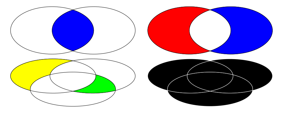
Polygons
I have also add a draw_polygon() to draw several polygons and shapes. It allows to draw squares, circles, triangles, inverted-L-like polygons, hearts and diamonds.
It may not be very useful, but it is cool.
l = draw_polygon(shape = "L", color = "Black", fill = NA)
s = draw_polygon(shape = "square", color = "red", fill = "cornflowerblue")
t = draw_polygon(shape = "triangle", color = "Black", fill = "pink")
c = draw_polygon(shape = "circle", color = "Black", fill = "yellow")
d = draw_polygon(shape = "diamond", color = "Black", fill = "red")
h = draw_polygon(shape = "heart", color = NA, fill = "red")
(l + s + t + c + h + d)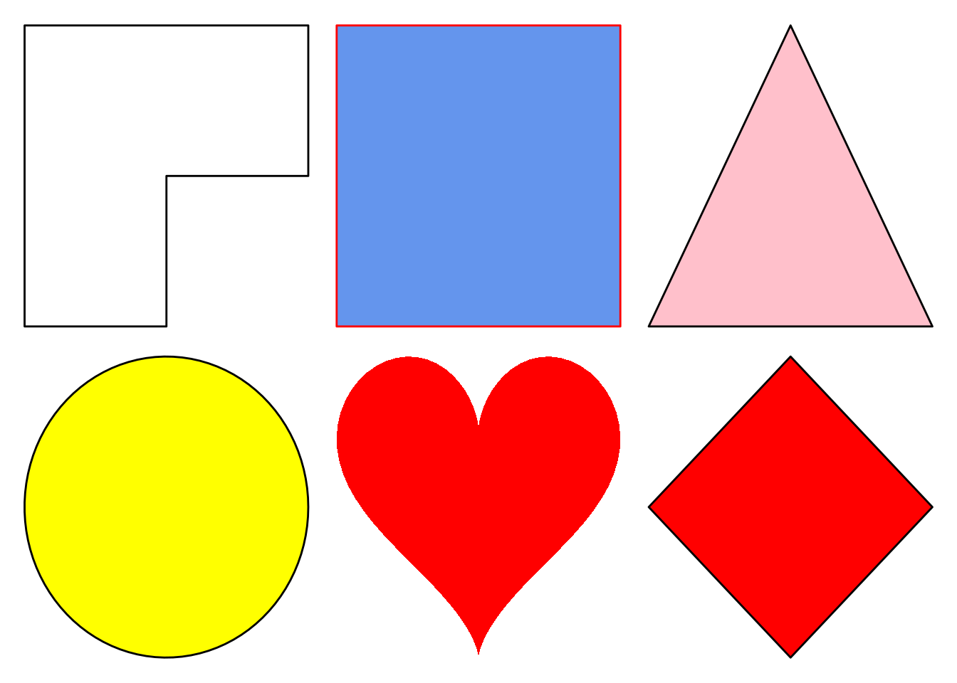
Themes
ggmitji have several themes to customize almost everything in a ggplot.